I was doing some research into some of the best SaaS website examples out there. I combed through a lot of different examples to find some that worked really well. In the end, there were a few websites that stuck with me, sites that I felt were very effective at one thing or another.
As a marketer, I was looking at how the website accomplishes the task of activating me as a user. Does the website address the reason I’m coming in the first place? Does the user experience, design-aesthetic and content align in a way that convinces me to click the CTA?
This of course with the caveat I am not actually shopping for these products. Therefore, I can’t say whether I would convert or not – which should be the site’s ultimate goal. Instead, I’m looking at elements and ideas that should inspire anyone developing the next greatest SaaS marketing website and making a few assumptions regarding the conversion.
In the B2B space, shiny objects get attention, but not the sale. B2C, where there’s a faster sales cycle, can be more glitz. In the B2B space, with longer sales cycles, and more feature-driven adoption, the glitz can do a disservice to your long-term and pragmatic relationship.
That said, here are nine examples of B2B SaaS websites that really stick out for being very well thought-out.
Who they are: A Workplace video messaging app.
What they do really well:
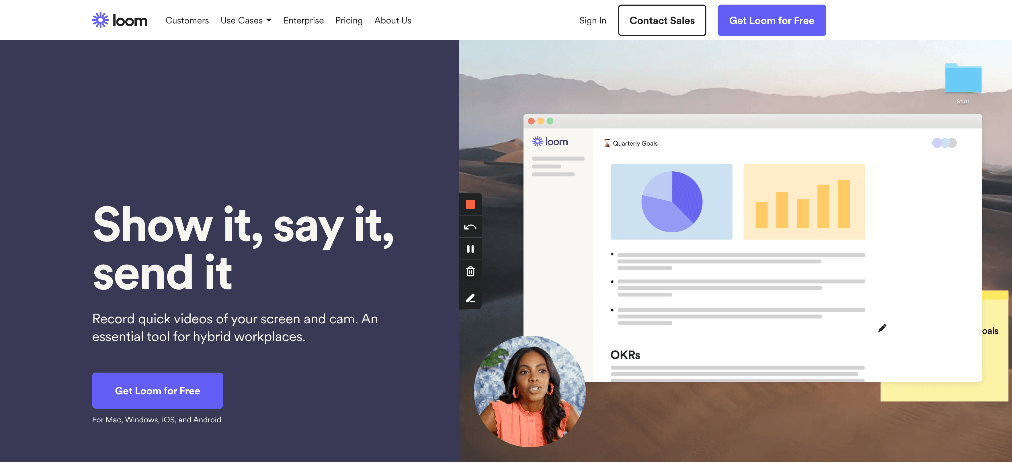
Without moving from the header, you’ll already have a good understanding of what their software does and what the end-user (your clients) would see.
There’s a good conversation to be had around the complexity of the sale and the number of words required to make a sale. Loom’s marketing website is a great example of being efficient in getting to the point. The layout requires so little text. It shows rather than tells. The result is that you know very quickly if you want to give the product a try.
For a freemium SaaS product, this website really hits the mark.
Draftbit
Who they are: Build mobile apps all from your browser.
What they do really well:
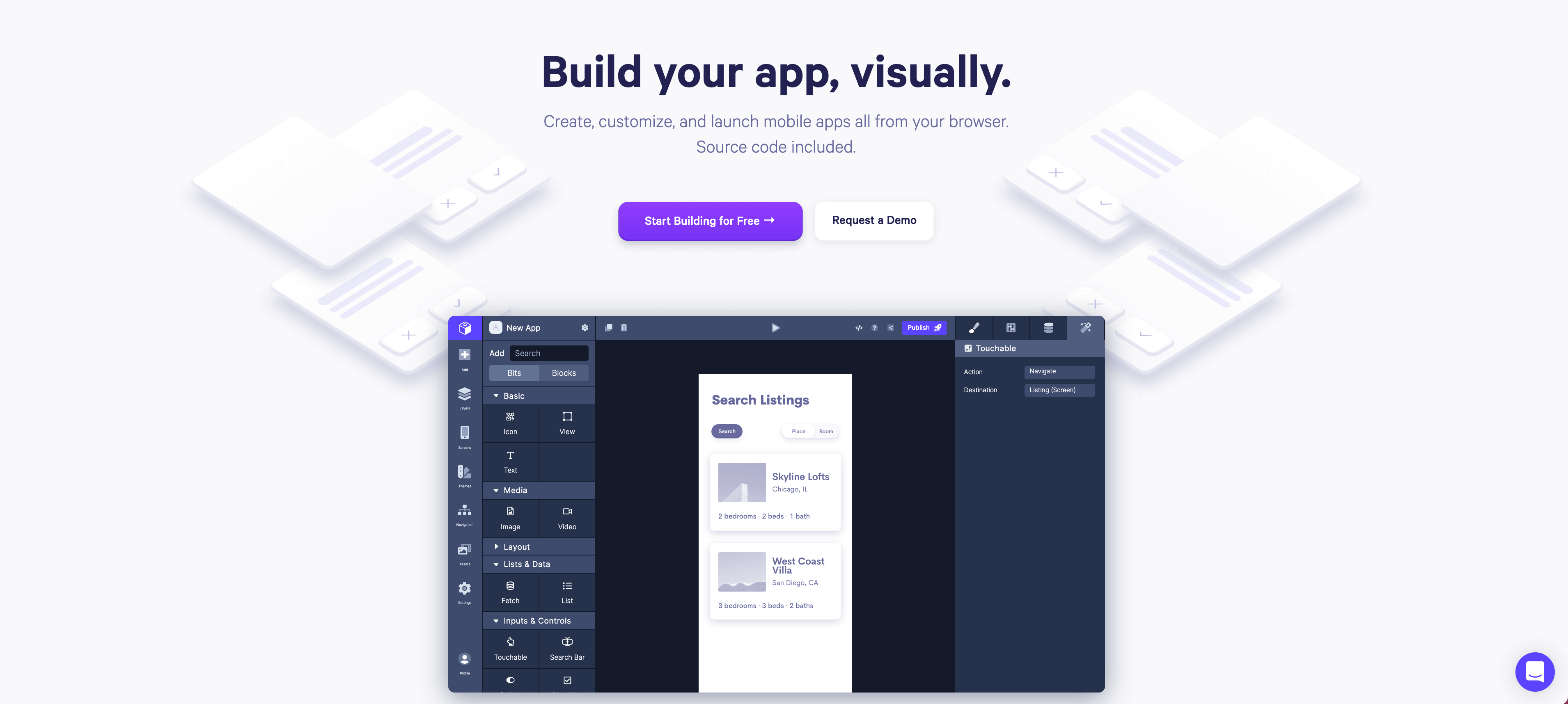
Another great example of a header that does a great job right off the bat at setting the tone. The clear, bold text and visual cues that might usually be decorative only really draw your attention to the CTA, almost funneling your eyes and narrowing them to the CTA. The funnel then feels like it opens up onto the product preview. It feels like a reveal. This is perhaps the strongest top-of-page I’ve seen of this group.
The homepage otherwise does a great job of marketing the SaaS with limited text, hyper-clean graphics, and a strong CTA.
And their features page deserves to be on every mood board.
Appcues
Who they are: Make product adoption easy, from onboarding to retention.
What they do really well::
Overall, I find this whole website to be very effective at everything from social proof and animations to eye-catching graphics that guide to the CTA. Lots of interesting things are happening here.
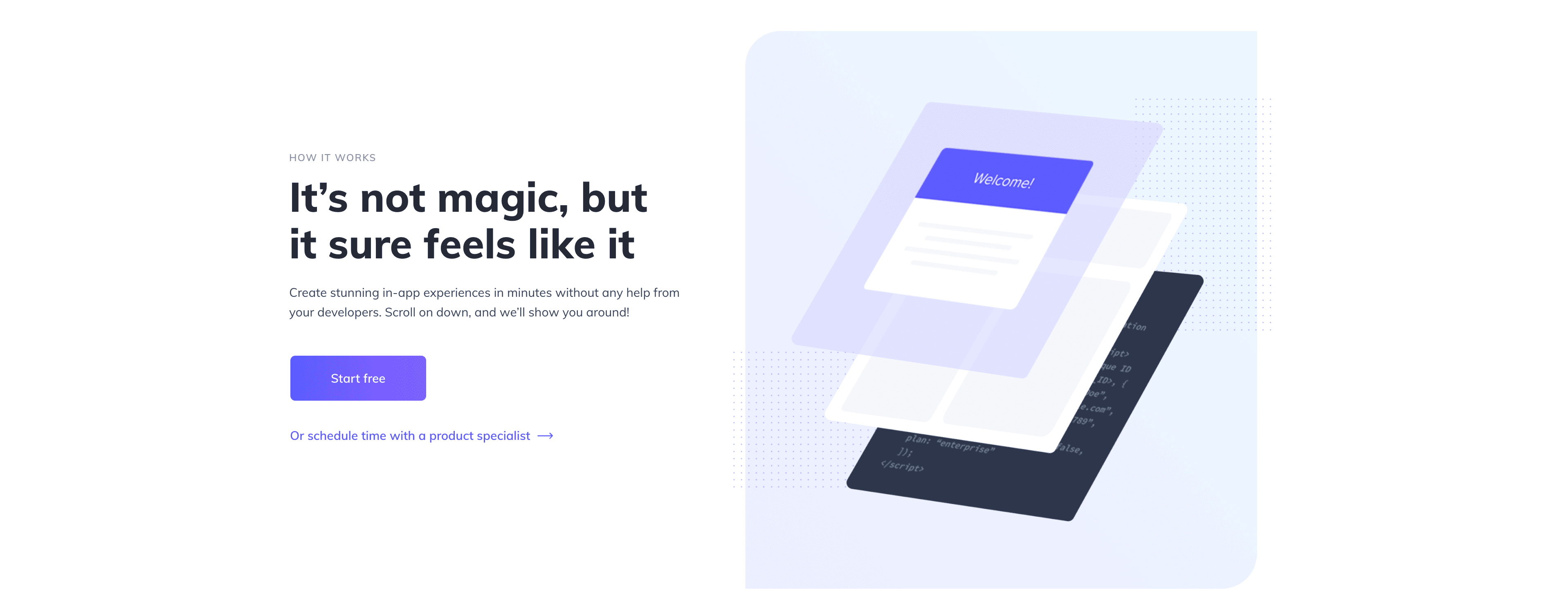
I was particularly drawn to how they laid out their “How it works” page. It builds emotion with a powerful headline (“It’s not magic, but it sure feels likes it”). It puts the product front-and-center, but with a step-by-step approach making it very intuitive. The way it lays out its case with clear product highlights is a great example of product storytelling.
Intercom
Who they are: A business messenger…or a way to keep your customers happier.
What they do really well:
There are a lot of great elements to dissect on their website. The positioning statement in the header is impossible not to ingest. Before you’ve read it you’ve been exposed to their “smile” element.
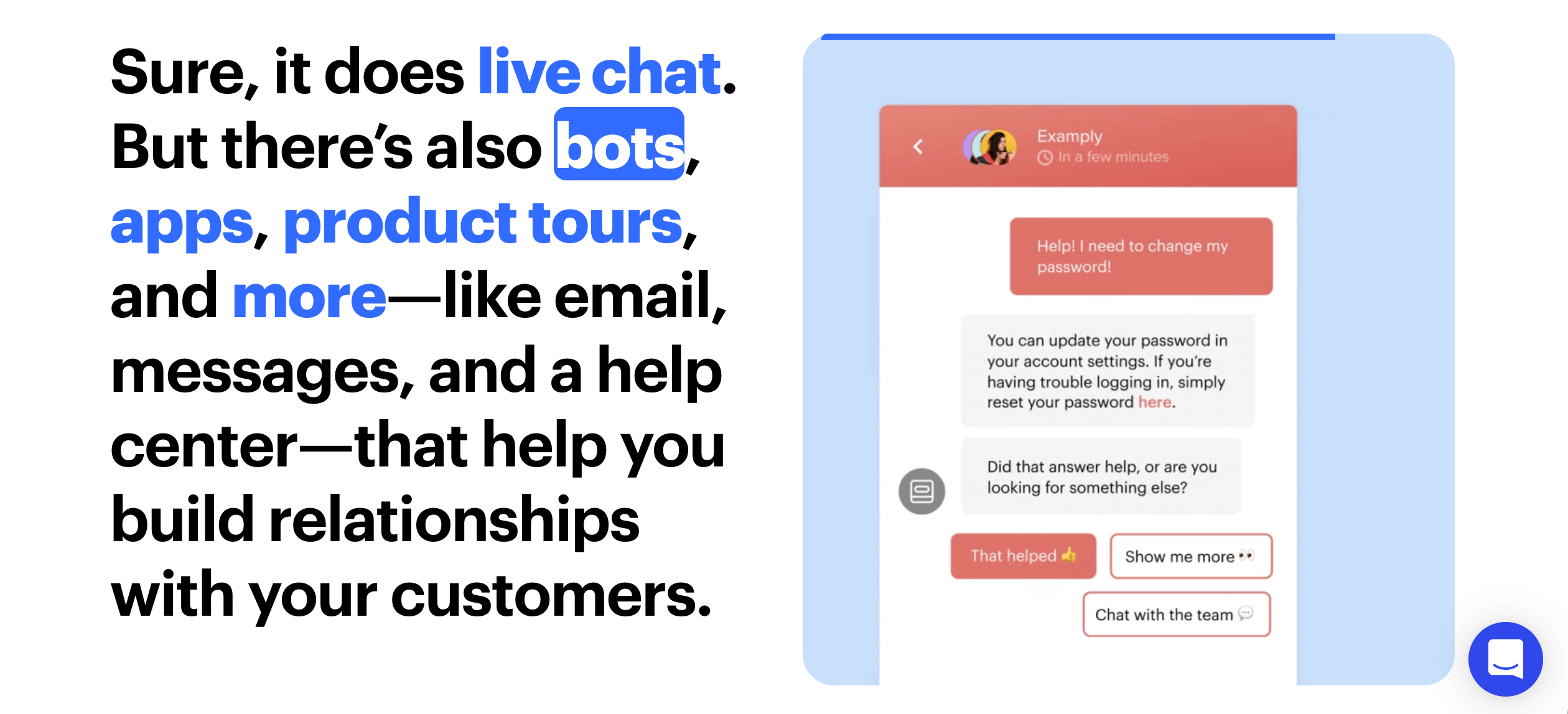
Just below the header on the homepage – you get the answer to “so why will people love this?” with very bold text while using color and links to cleverly connect the text to the animations beside it. Lots of happiness, love, and playful animation – not the typical adjectives used to describe a B2B SaaS website.
Otherwise, very solid use of sporadic color and doodles. They also have a blog that is (or should be) the envy of every content marketer out there.
Toggl
Who they are: Three tools designed to “make any job a dream job”(planning, hour tracking, and a hiring assistant) .
What they do really well:
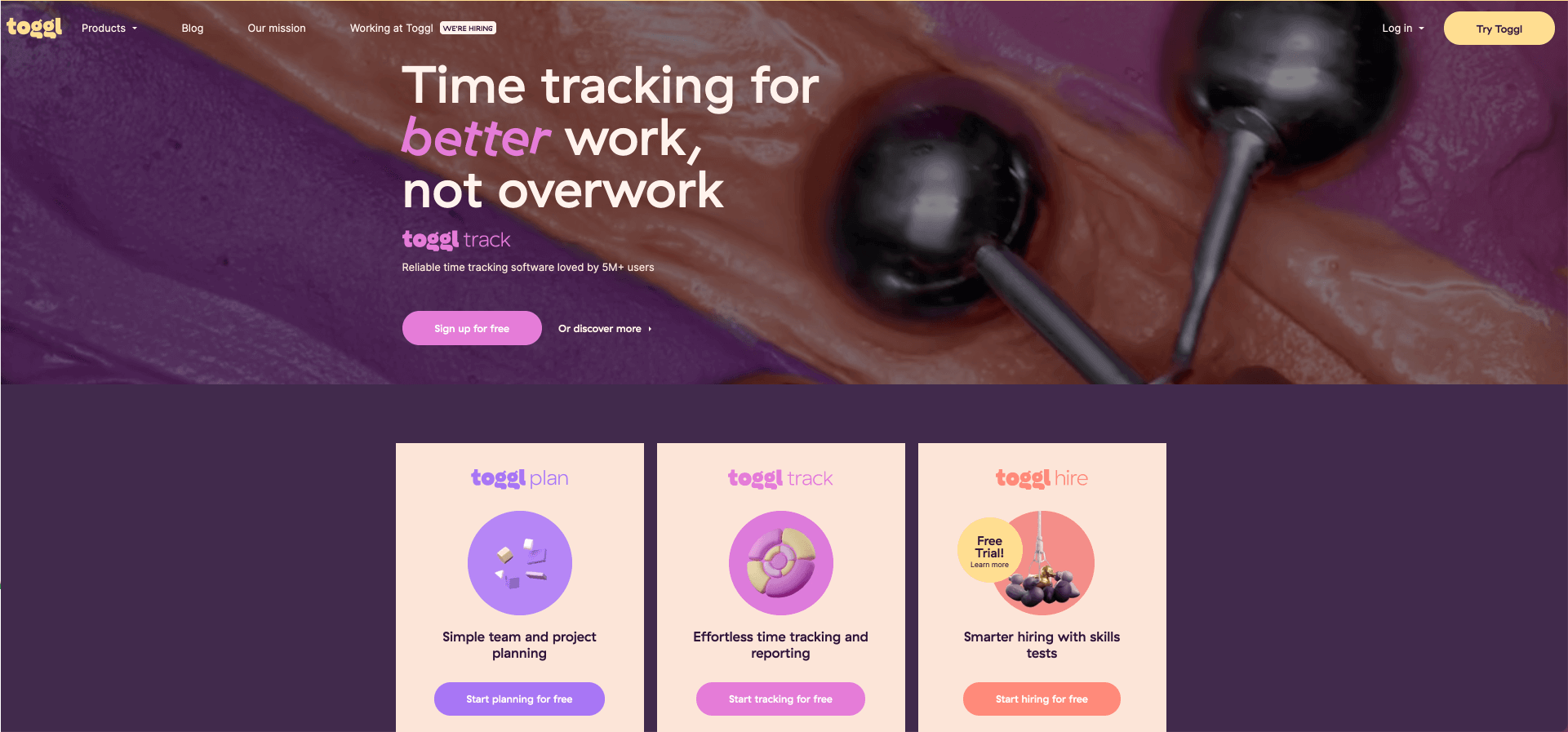
Is this the most fun you are allowed to have on a B2B SaaS website? Toggl has built a smart, colorful and very engaging website.
A few things I really like:
- Use of ice cream? I guess that’s subjective. But this is the best use of ice cream in web design I’ve come across.
- Studies show that people scan copy and are not hanging on your perfectly crafted sentences. Bold has typically been a go-to technique for guiding users and helping them scan through information. Toggl turns texts on an angle throughout their site and it definitely catches the eye.
- Beautiful use of animations and elements throughout.
- They highlight product features really well.
And there’s much more. I think this is a website that can divide people. But that also means it has an idea. That said, I would imagine that using their products would be fun.
Whimsical
Who they are: A suite of collaboration tools from docs and flowcharts to wireframes and more.
What they do really well:
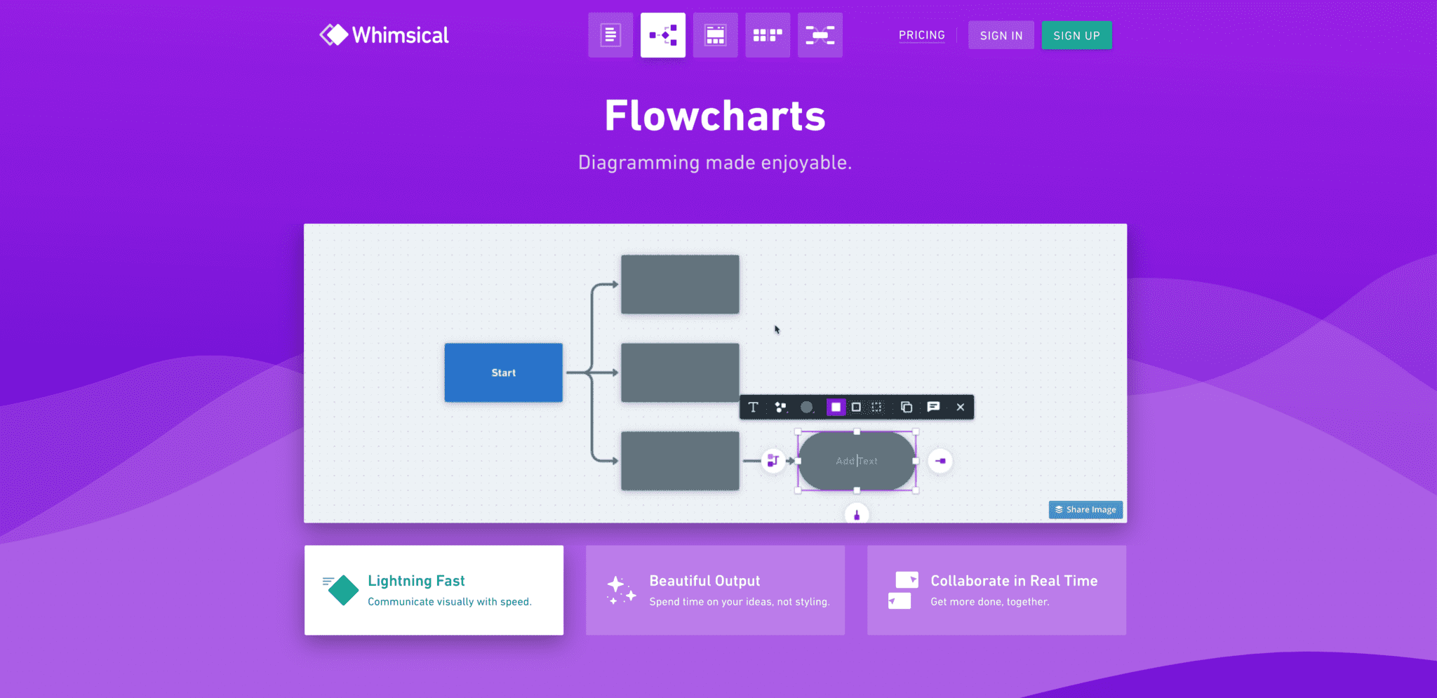
Often the homepage feels like a space that acts more like an executive summary than anything else. Sometimes you get more of an introduction, while the header is the “book cover”. Whimsical’s homepage gives you the cover, but ends at the table of contents. And perhaps we need more of that? If we accept that the user will generally not convert from the homepage, why put everything there? Do I really need an executive summary when browsing the key website pages should only take a few minutes?
In Whimsical’s case, they position their five products as distinct, and this is reflected in their navigation. Extra marks for their very unique website navigation, I can’t think of many visual navigation bars.
Also, they use product demo Gifs really well. Oh and color. Lots more color here, but that is likely playing on their “Whimsical” brand.
And bonus points for the procrastinator’s flowchart.
Hellosign
Who they are: An eSignature SaaS.
What they do really well:
I want to caveat this list and say I don’t think all these sites are perfect.
There are a few things about Hellosign that I think really connect, even if these ideas don’t apply to every SaaS.
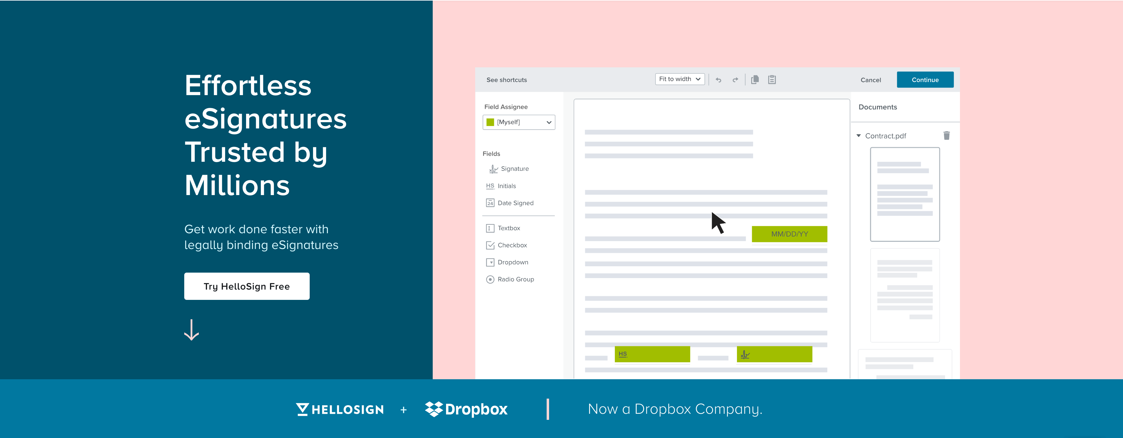
Like Loom above they use a really strong approach to the hero banner – with a big header next to a clear product showcase that makes the value proposition very clear in 15 seconds.
What’s unique about their homepage is how quickly they get into features and pricing breakdown. Perhaps this is a trend in areas that will or have become more commodified? It definitely helps me get right down to business to determine if this is the right solution faster and with incredible transparency.
Pandadoc and Evernote
Who they are: Software to create, edit, and sign documents and a note-organizing app.
What they do really well:
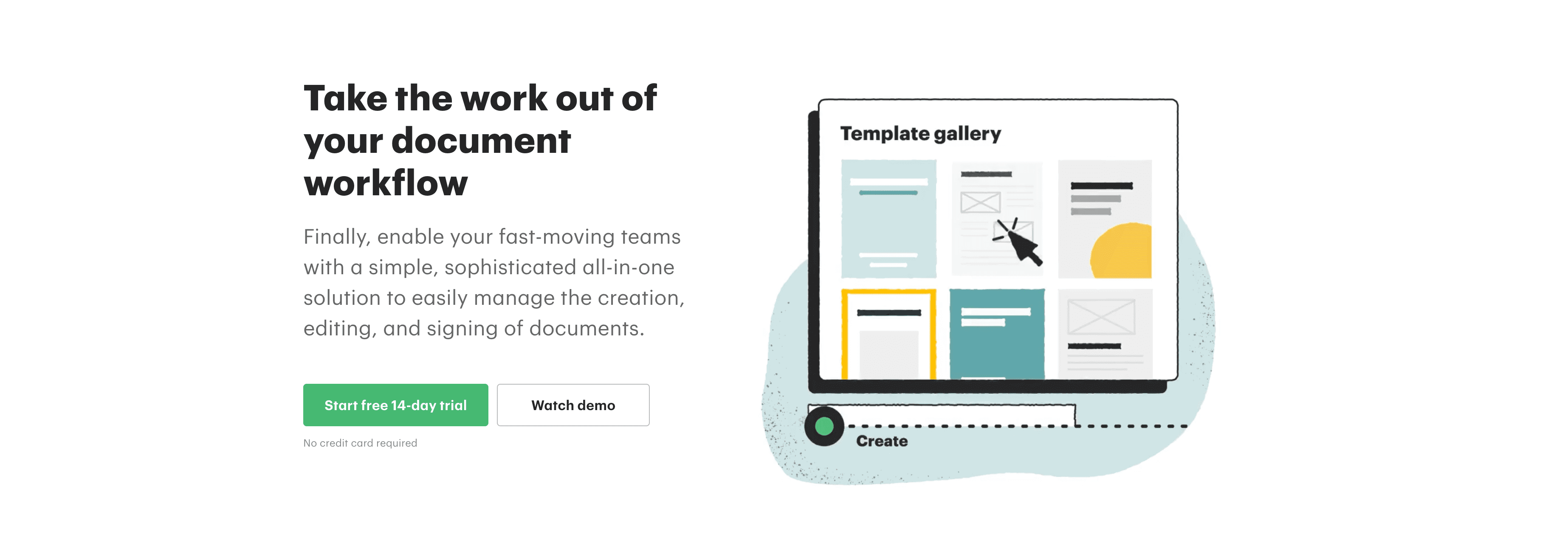
I lumped these two together because they both execute very well on many of the tried and tested SaaS website best practices. If you are looking for classic B2B SaaS websites, I feel like these two are very solid. Which in the SaaS world can be the most important thing. Right? You aren’t looking to date a SaaS…you expect to have a long term relationship.
Figma (VS Sketch)
Who they are: Collaborative design and prototyping made very easy.
What they do really well:
When you are targeting designers, you know how important design is going to be. Figma nails it. The product really shines in both cases. They also have cues throughout that communicate to designers that this is a designer’s product.
It is a great exercise to put Sketch and Figma side-by-side to see how these two very competitively positioned companies position themselves. We use Figma – only because of word-of-mouth. I’d wonder if either of these websites are critical in converting. Does which website is better built even matter in this case? I’d bet in this case, most people have already made a conversion decision before coming to the respective website.
I hope this inspires some ideas for your own SaaS website – whether a redesign or simply an update. Either way, when you are working on your new designs, be sure to check out how ReviewStudio can support your website review and approval workflows.

